

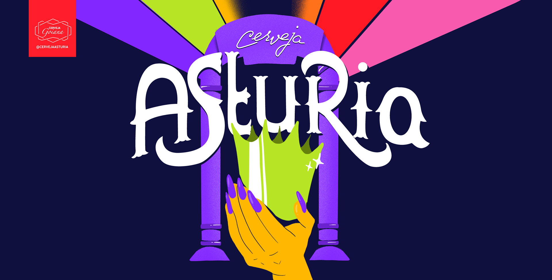

Asturia Sour Pride Pride | LGBTQIAPN+
EN
The project Queer, Design and Packaging emerges from the need to question how design can contribute to building more inclusive narratives within the craft beer market. More than just creating attractive labels, the proposal is anchored in the idea that packaging can serve as a space for symbolic, cultural, and social representation. Through this study, the aim was to develop visual solutions that not only translate the values of the LGBTQIAP+ community but also break away from the stereotypes still dominant in much of the visual communication targeted at this audience.
PT
O projeto Queer, Design e Embalagem nasce da necessidade de questionar como o design pode contribuir para a construção de narrativas mais inclusivas dentro do mercado das cervejas artesanais. Mais do que criar rótulos atrativos, a proposta se ancora na ideia de que a embalagem pode ser um espaço de representação simbólica, cultural e social. Através desse estudo, buscou-se desenvolver soluções visuais que não apenas traduzem os valores da comunidade LGBTQIAP+, mas também rompem com os estereótipos que ainda predominam em grande parte da comunicação visual dirigida a esse público.
EN
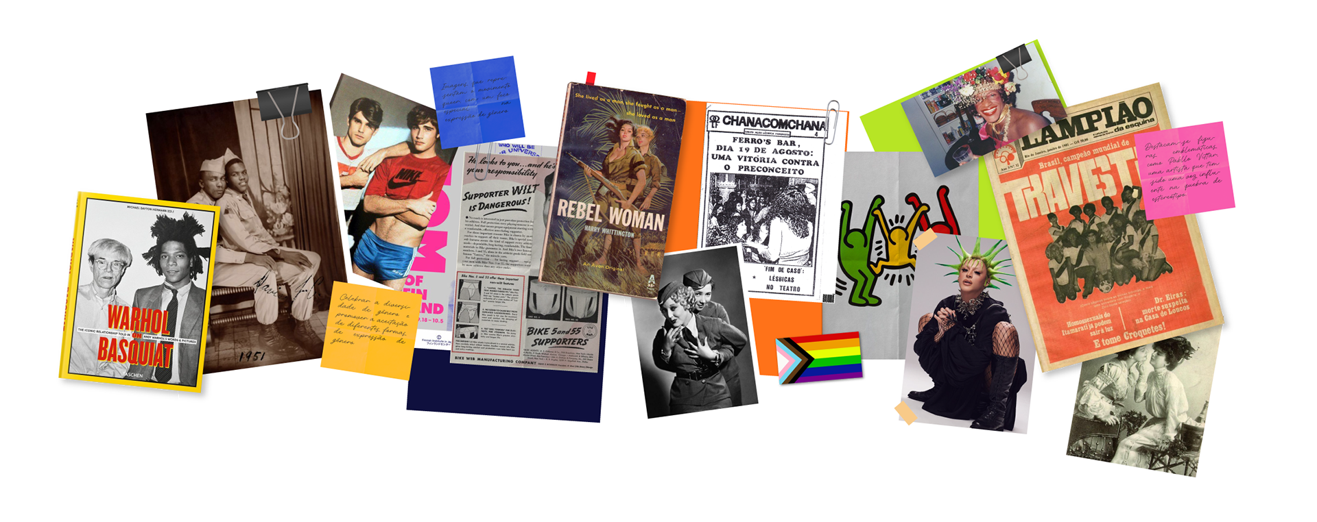
The visual research was structured into semantic panels that brought together historical, cultural, and aesthetic references tied to the queer community. These panels explored everything from icons and symbols associated with social movements to artistic and graphic representations that marked different eras. The goal was not just to collect images but to understand how these visual languages helped shape identities and strengthen political agendas. At the same time, the study highlighted recurring gaps and stereotypes, pointing toward a more conscious, representative, and innovative design approach.
PT
A pesquisa visual foi estruturada em painéis semânticos que reuniram referências históricas, culturais e estéticas ligadas à comunidade queer. Esses painéis exploraram desde ícones e símbolos associados a movimentos sociais até representações artísticas e gráficas que marcaram diferentes épocas. A ideia não foi apenas coletar imagens, mas compreender como essas linguagens visuais ajudaram a moldar identidades e a fortalecer pautas políticas. Ao mesmo tempo, o estudo permitiu identificar lacunas e estereótipos recorrentes, apontando caminhos para um design mais consciente, representativo e inovador.
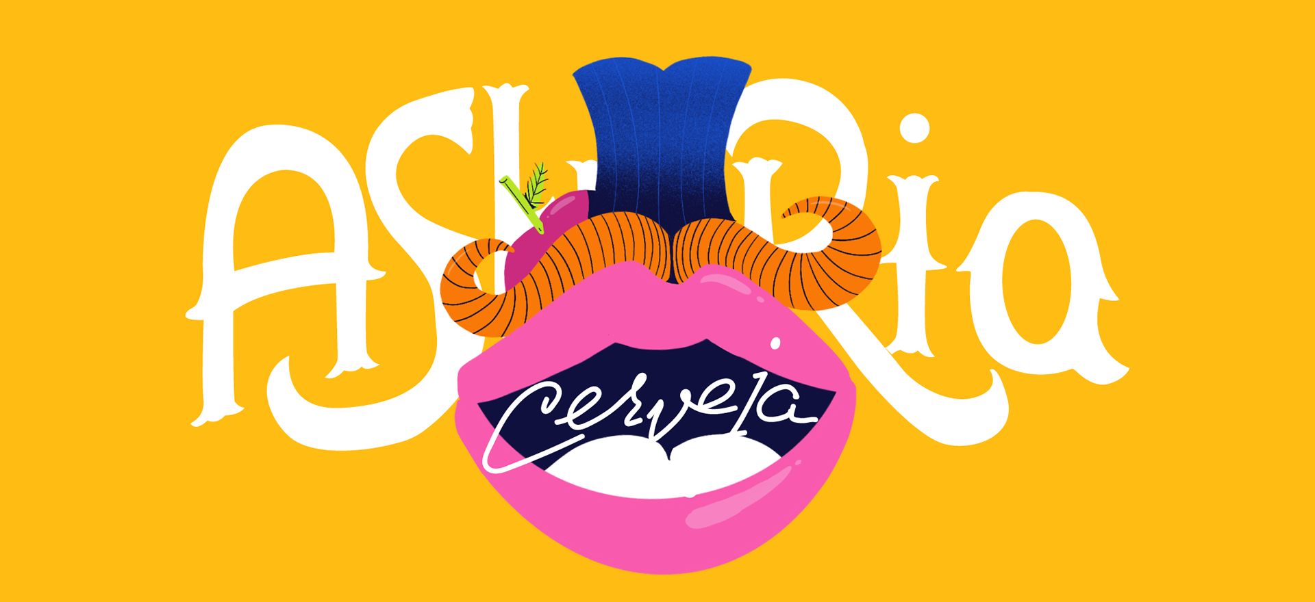
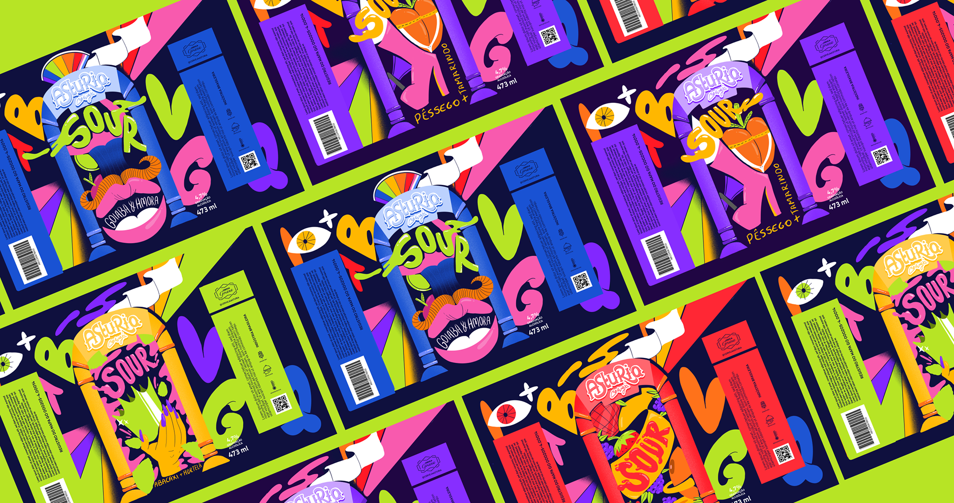
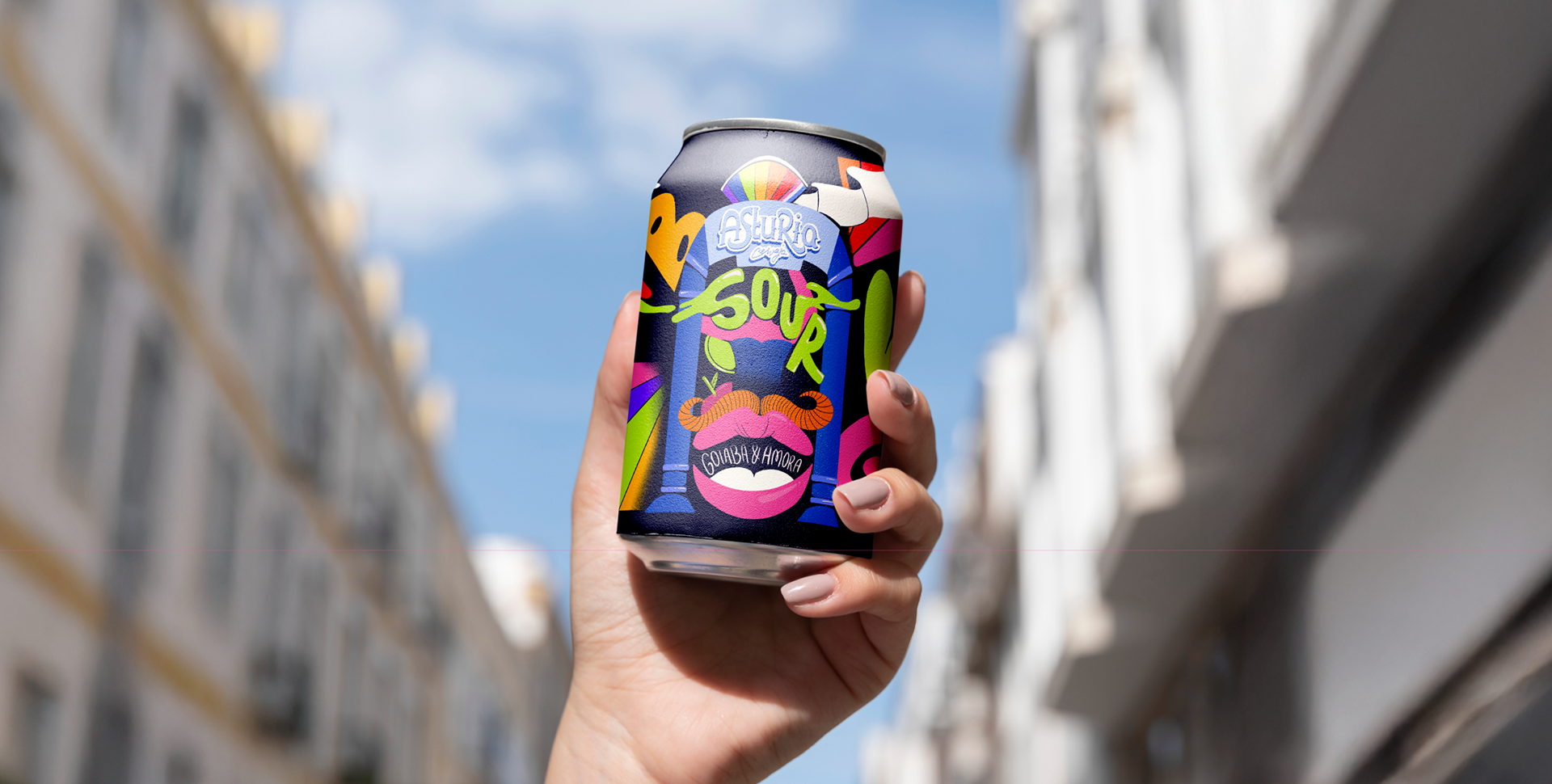
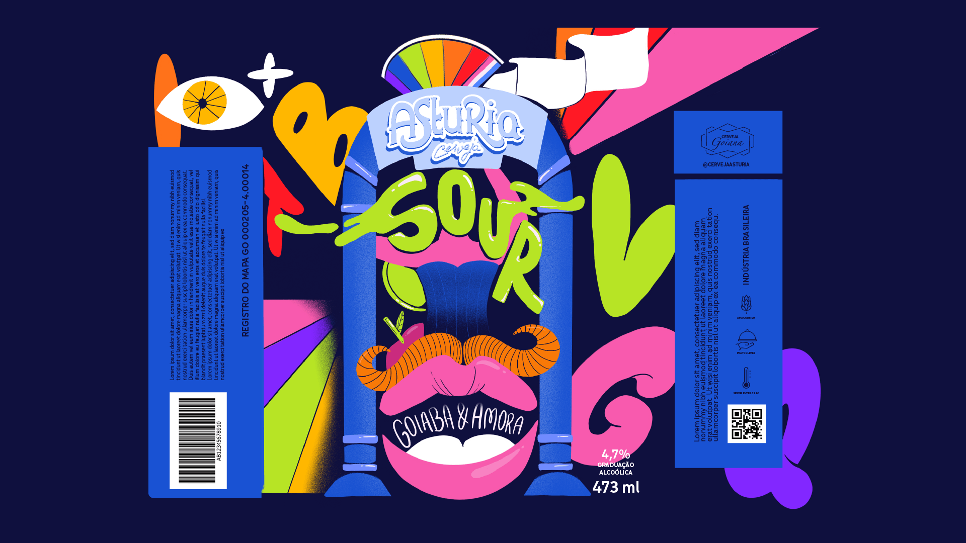
Goiaba e Amora
EN
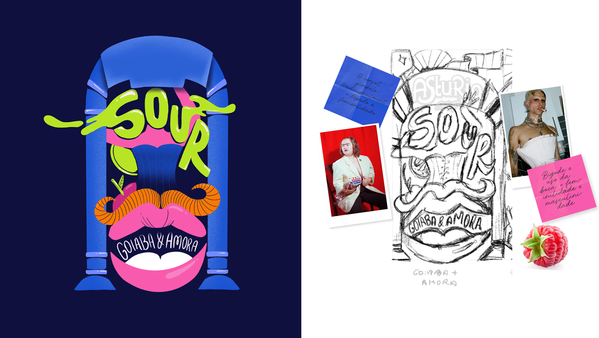
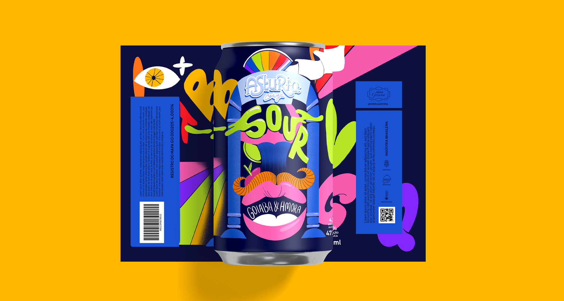
The Goiaba and Amora packaging is built on the idea of contrast as a visual narrative. The corset, traditionally associated with femininity, appears alongside the mustache and mouth, elements linked to masculinity. This intentional combination creates a visual tension that questions gender norms and deconstructs cultural expectations about the body and identity. The label thus becomes a space of aesthetic provocation and critical reflection, inviting the audience to rethink rigid notions of femininity and masculinity.
PT
A embalagem de Goiaba e Amora parte da ideia do contraste como narrativa visual. O corset, símbolo tradicionalmente ligado à feminilidade, aparece ao lado do bigode e da boca, elementos associados à masculinidade. Essa combinação intencional cria uma tensão visual que questiona normas de gênero e desconstrói expectativas culturais sobre o corpo e a identidade. O rótulo se torna, assim, um espaço de provocação estética e reflexão crítica, convidando o público a repensar noções rígidas de feminilidade e masculinidade.

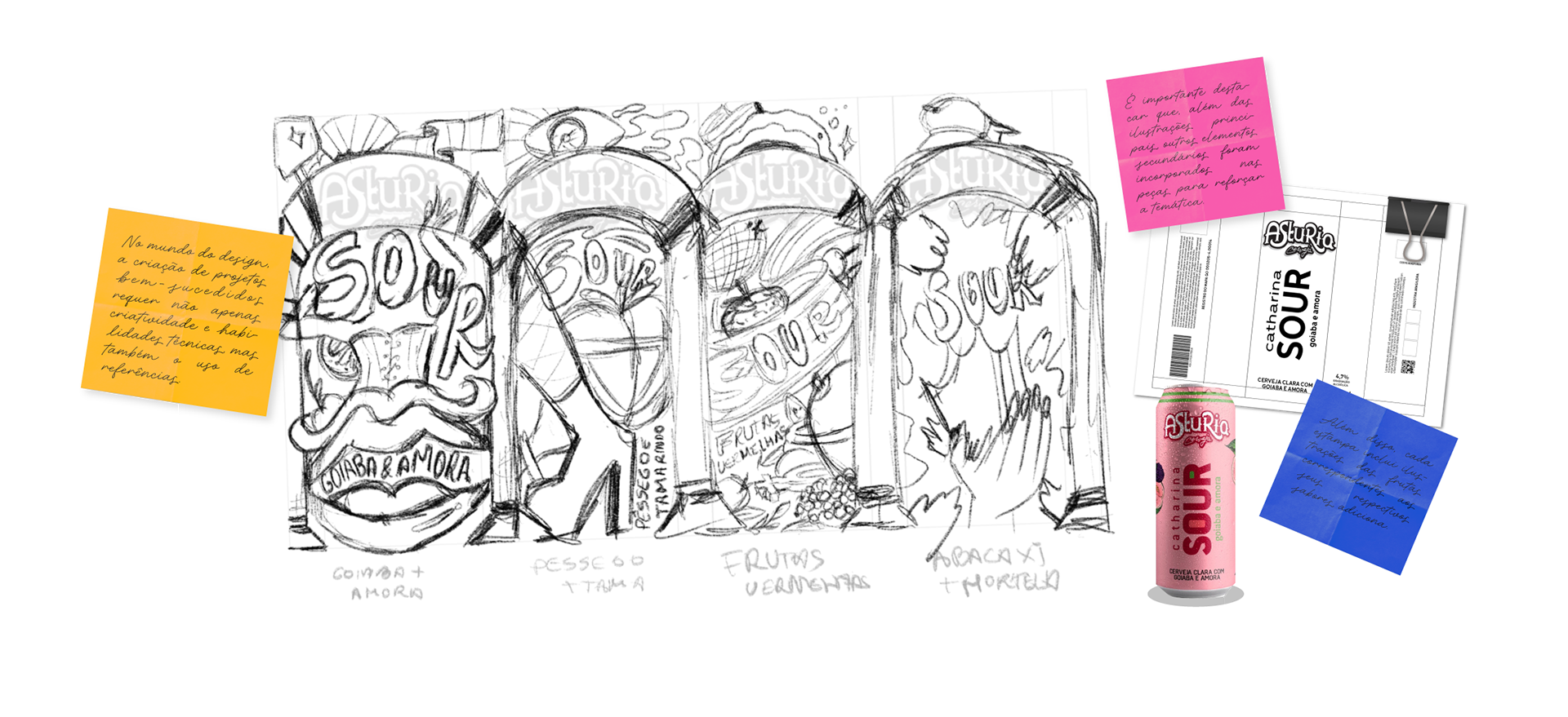
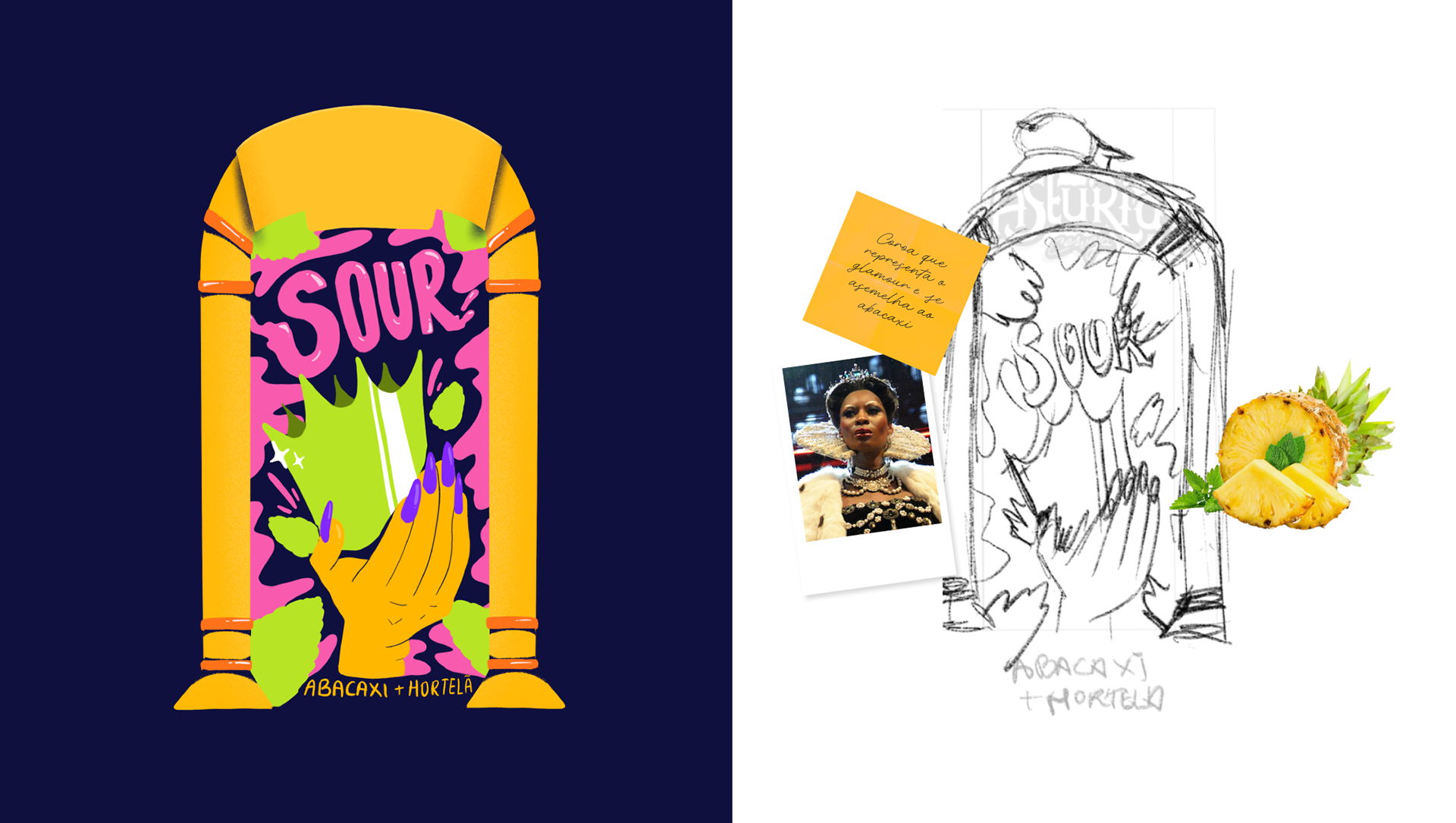
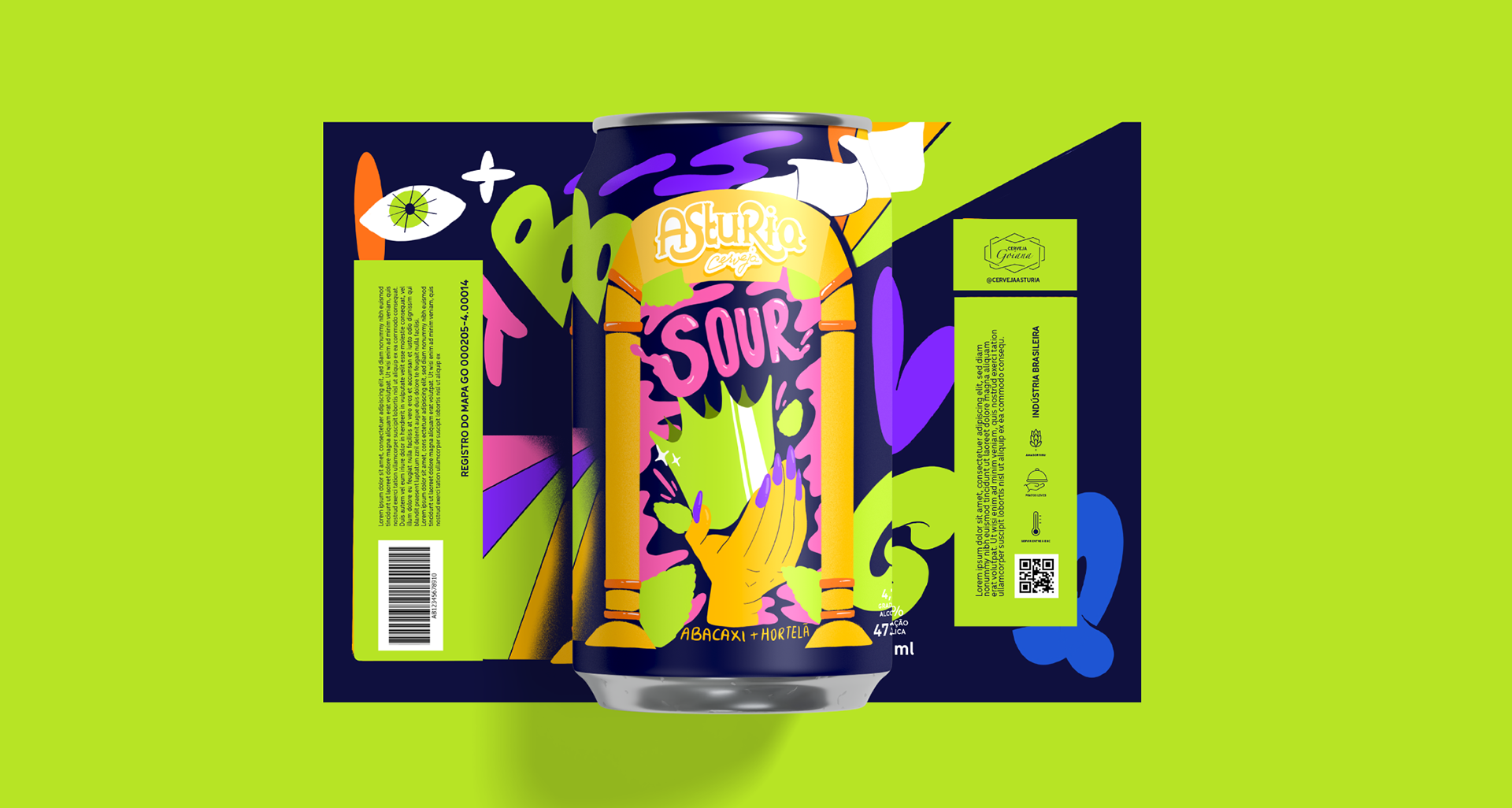
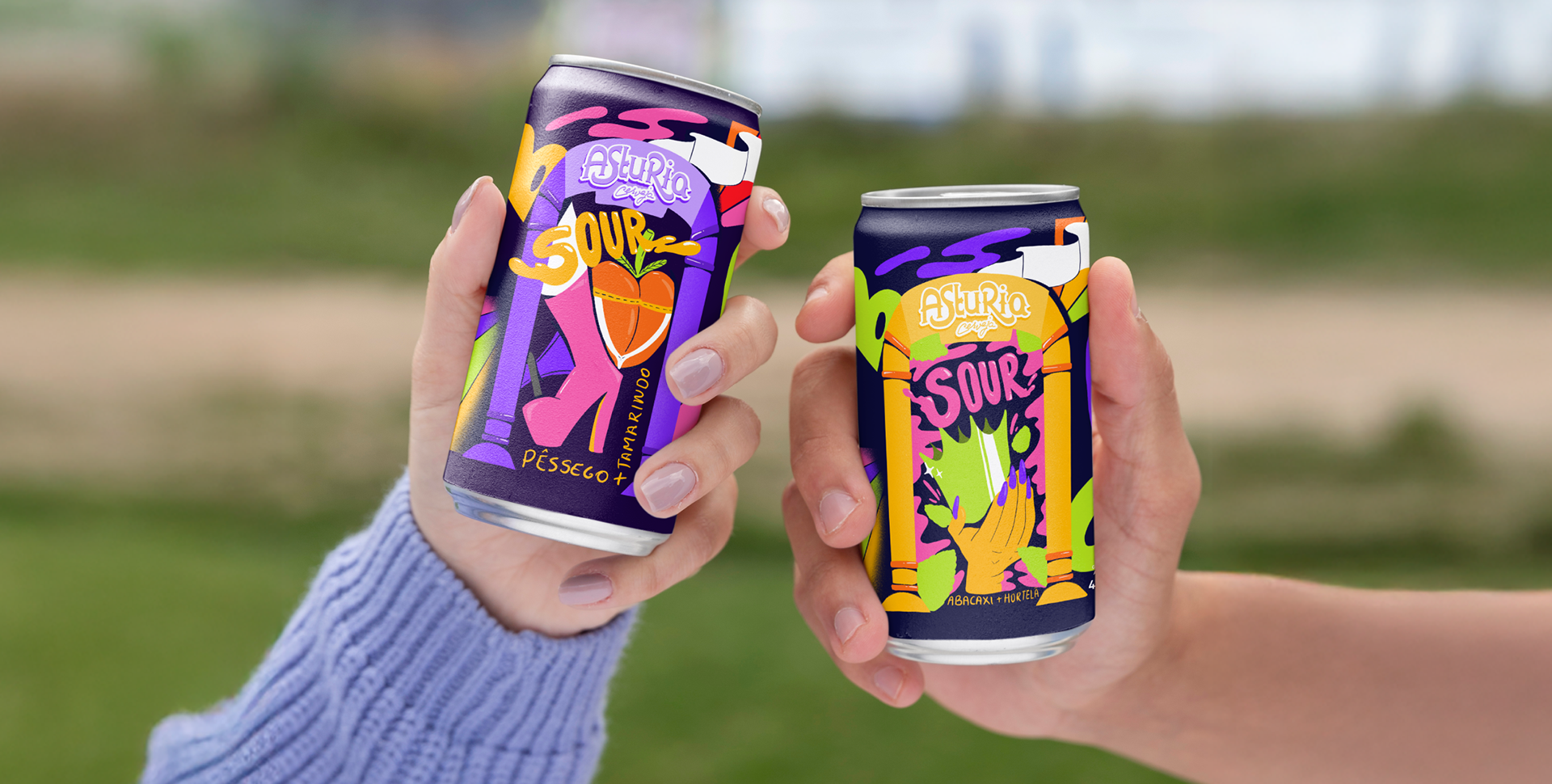
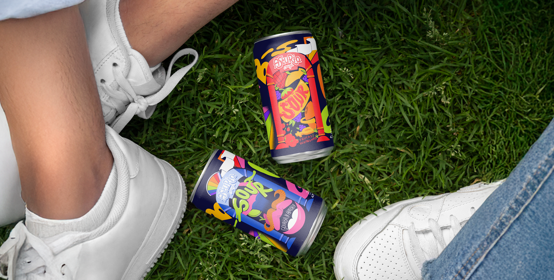
Abacaxi e Hortelã
EN
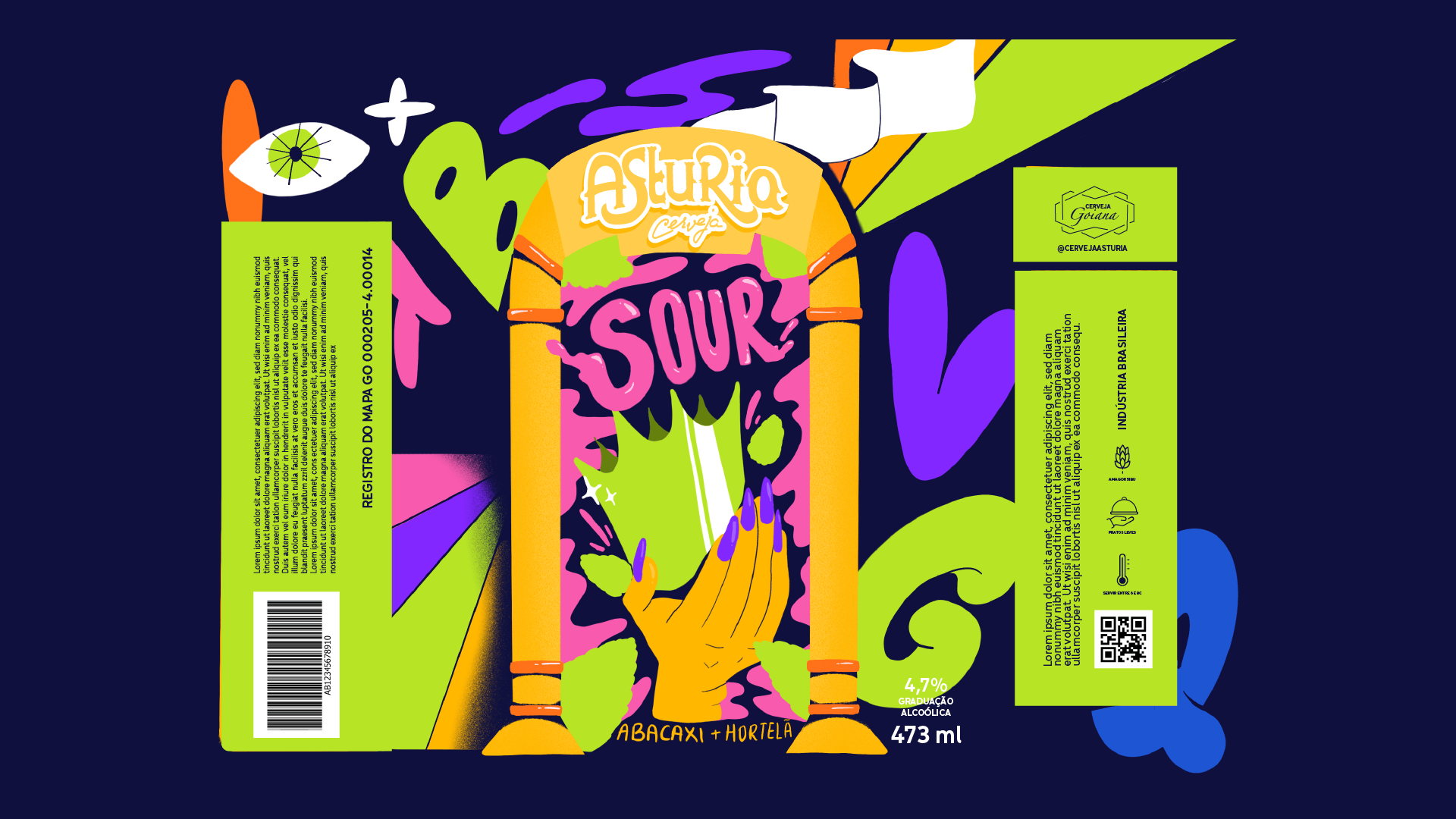
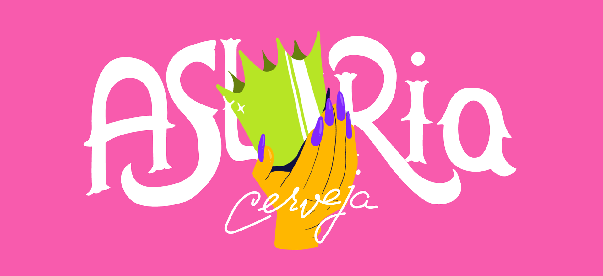
In the Abacaxi and Hortelã version, the crown stands as the central element of the composition. Beyond directly referencing the fruit, the crown also carries significant symbolism within the LGBTQIAP+ movement, tied to queer royalty and empowerment. Alongside it, hands with long nails reinforce the performative and expressive dimension, evoking both drag aesthetics and gender expression freedom. In this case, the packaging celebrates visual exuberance and the multiplicity of symbolic codes within the community.
PT
Na versão Abacaxi e Hortelã, a coroa é o elemento central da composição. Além de remeter diretamente à fruta, a coroa também carrega consigo um simbolismo importante dentro do movimento LGBTQIAP+, relacionado à realeza queer e ao empoderamento. Ao lado dela, mãos com unhas longas reforçam a dimensão performática e expressiva, evocando tanto a estética drag quanto a liberdade de expressão de gênero. A embalagem, nesse caso, celebra a exuberância visual e a multiplicidade de códigos simbólicos da comunidade.
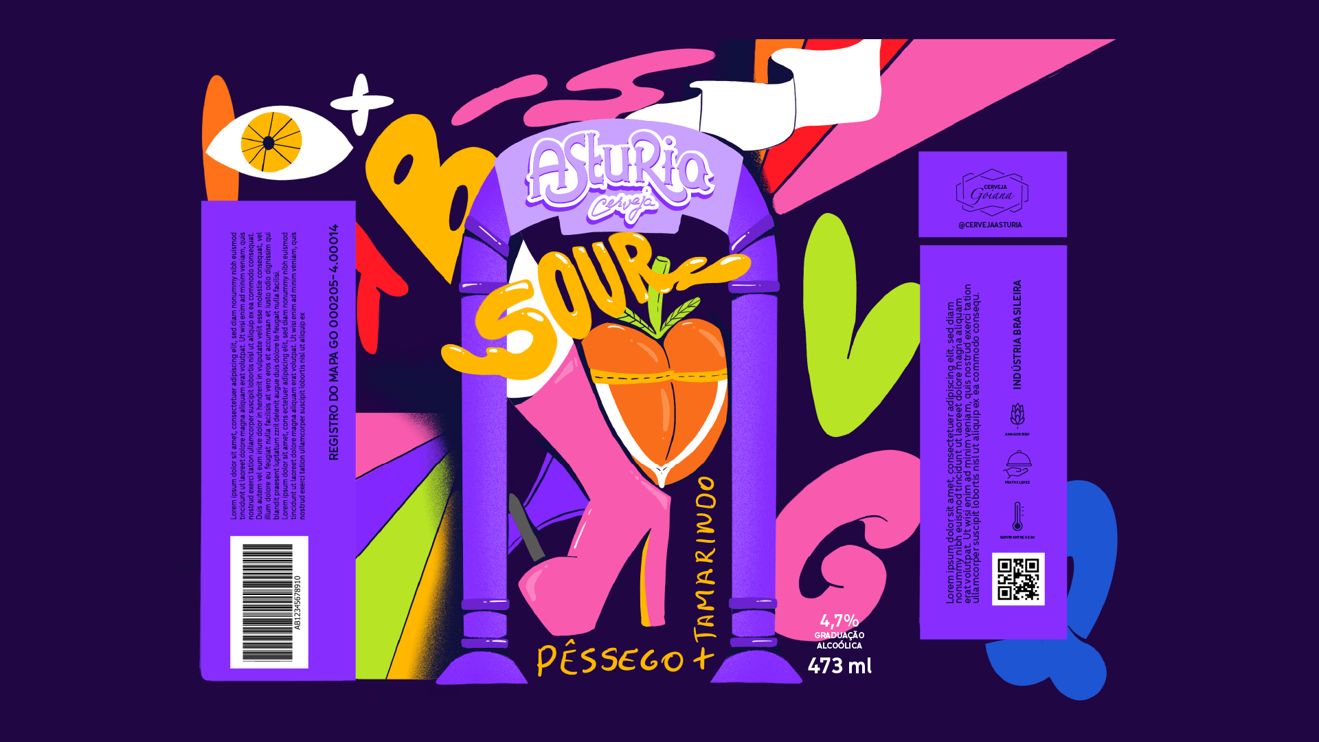
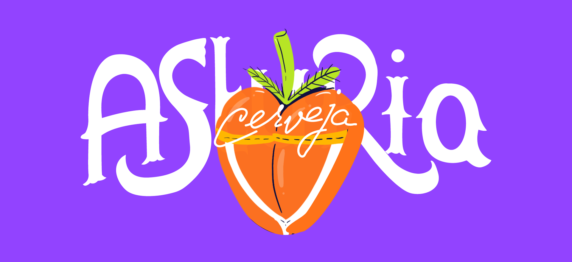
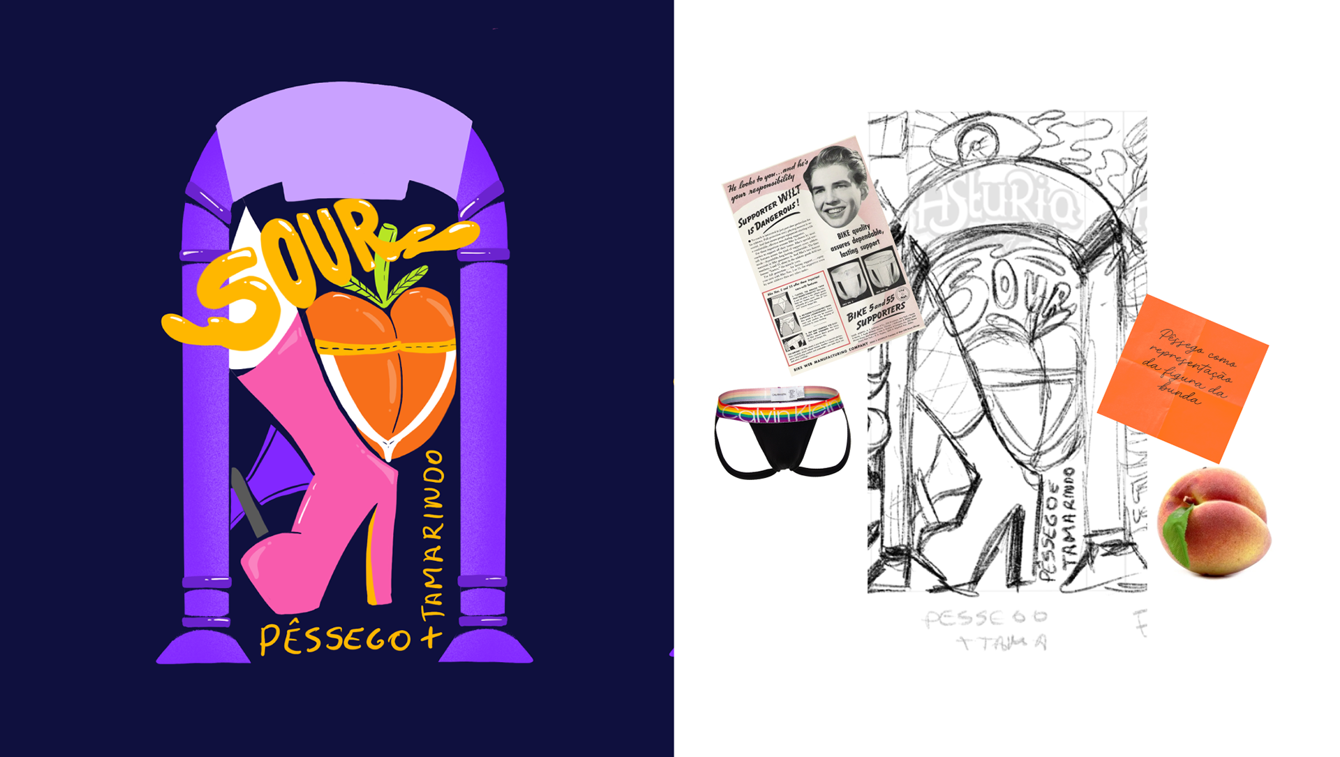
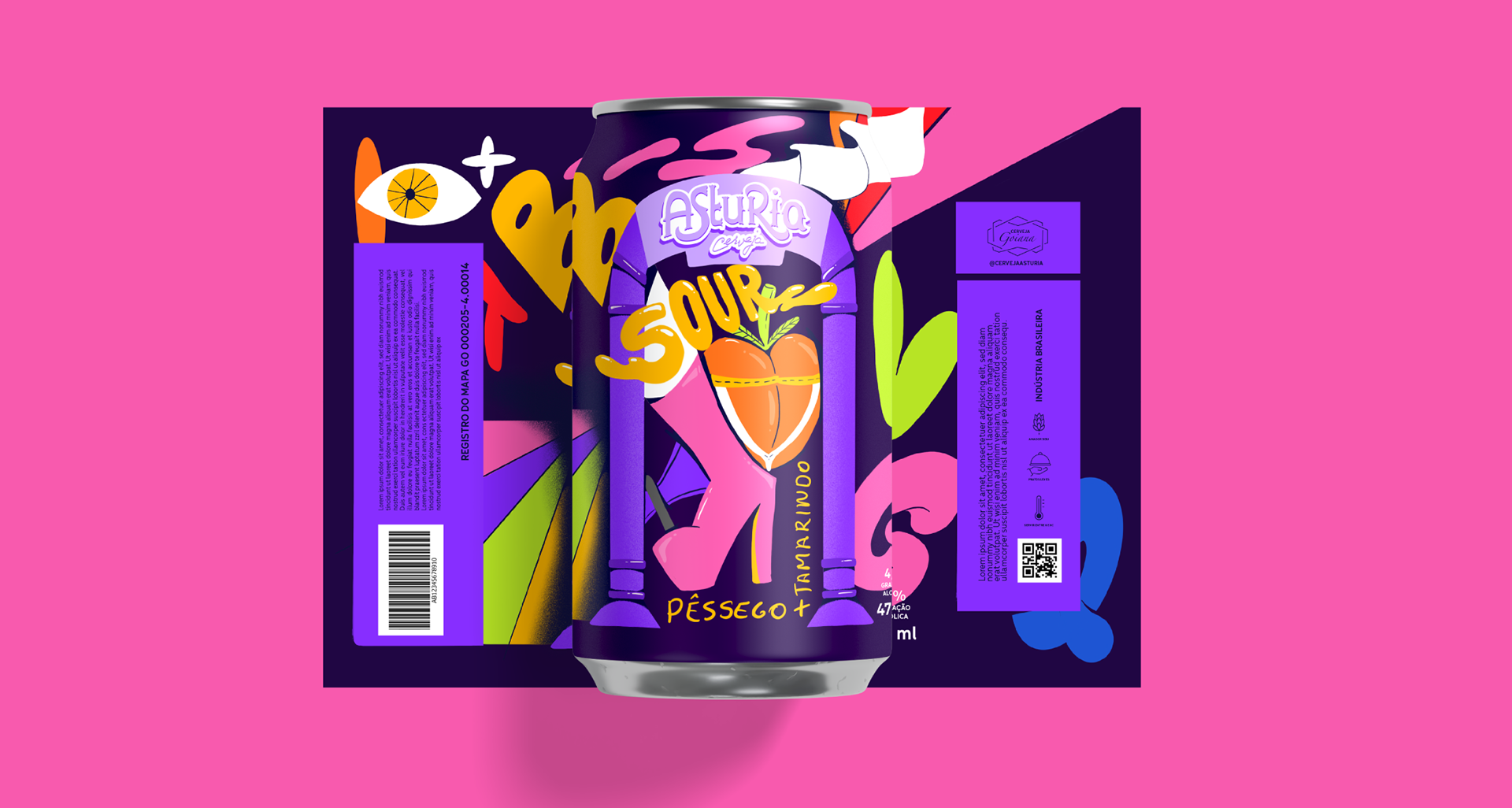
Pessêgo e Tamarindo
EN
The Pêssego and Tamarindo label directly engages with references from gay and drag queen culture. The peach, already a symbol tied to sexuality, is combined with the jockstrap and boots, elements rooted in fetish aesthetics and queer performance. The composition adopts a provocative and playful tone, consciously playing with stereotypes without reducing them. Here, the packaging conveys humor and irreverence while reinforcing the cultural power of performance as an expression of identity.
PT
O rótulo de Pêssego e Tamarindo dialoga diretamente com referências da cultura gay e drag queen. O pêssego, que por si só já é um símbolo associado à sexualidade, aparece combinado ao jockstrap e às botas, elementos presentes na estética do fetiche e na performance queer. A composição adota um tom provocativo e divertido, jogando com estereótipos de maneira consciente, mas sem reduzi-los. Aqui, a embalagem não só carrega humor e irreverência, como também reforça a potência cultural da performance como expressão de identidade.
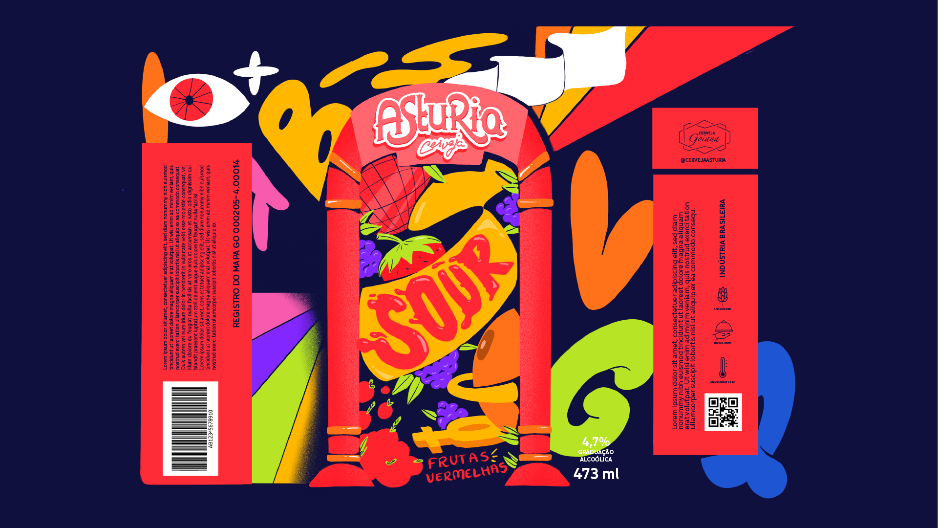
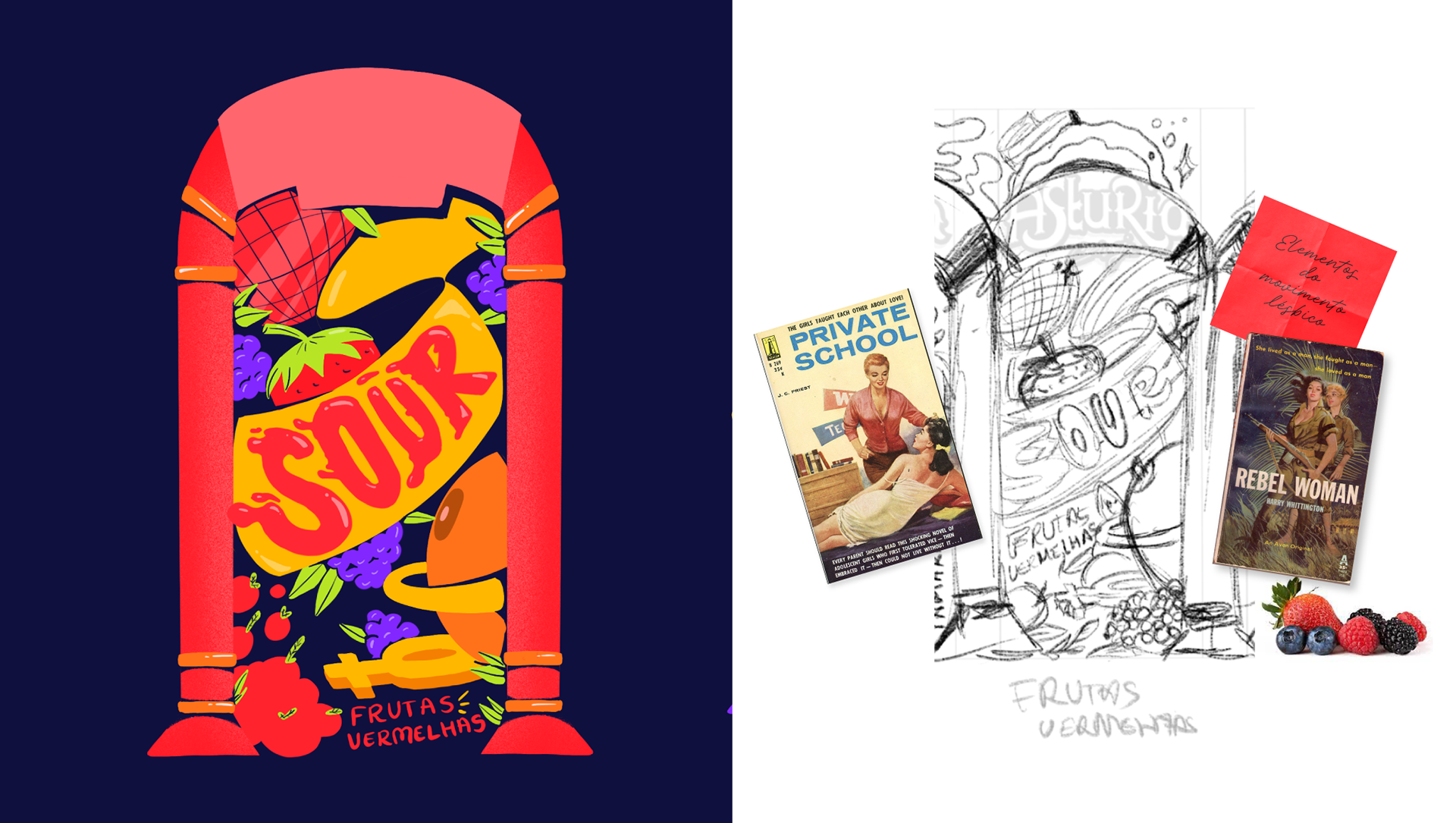
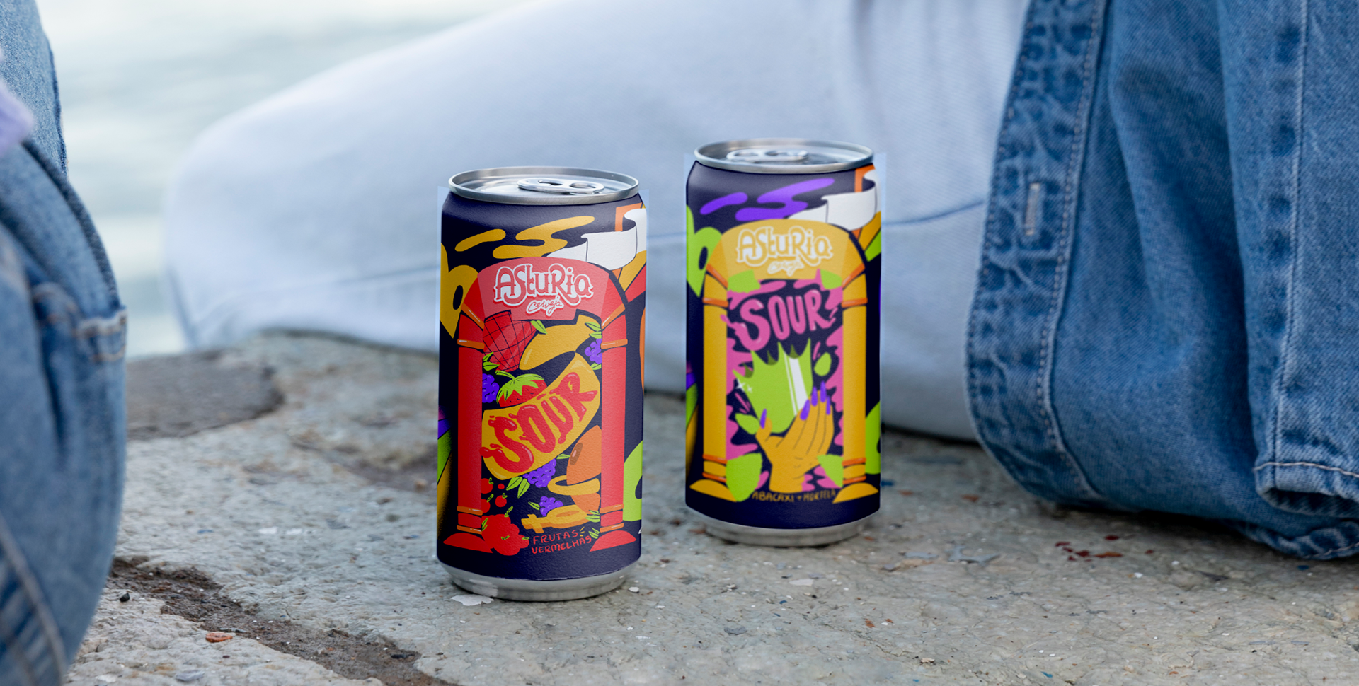
Frutas vermelhas
EN
The Frutas Vermelhas edition draws inspiration from ballroom culture, featuring the disco ball as its central icon. This element, associated with celebration and resistance, is accompanied by gender symbols and the representation of the female breast, creating a narrative that intertwines festivity, body, and identity. The packaging translates the vibrant and collective atmosphere of ballrooms—spaces that historically offered shelter and visibility for queer and trans people—bringing that energy into the world of packaging design.
PT
A edição Frutas Vermelhas foi inspirada na cultura ballroom, trazendo a bola espelhada como ícone central. Esse elemento, associado à celebração e à resistência, é acompanhado por símbolos de gênero e pela representação do seio feminino, criando uma narrativa que mistura festa, corpo e identidade. A embalagem traduz a atmosfera vibrante e coletiva das ballrooms, espaços que historicamente ofereceram acolhimento e visibilidade para pessoas queer e trans, e transporta essa energia para o universo do design de embalagens.

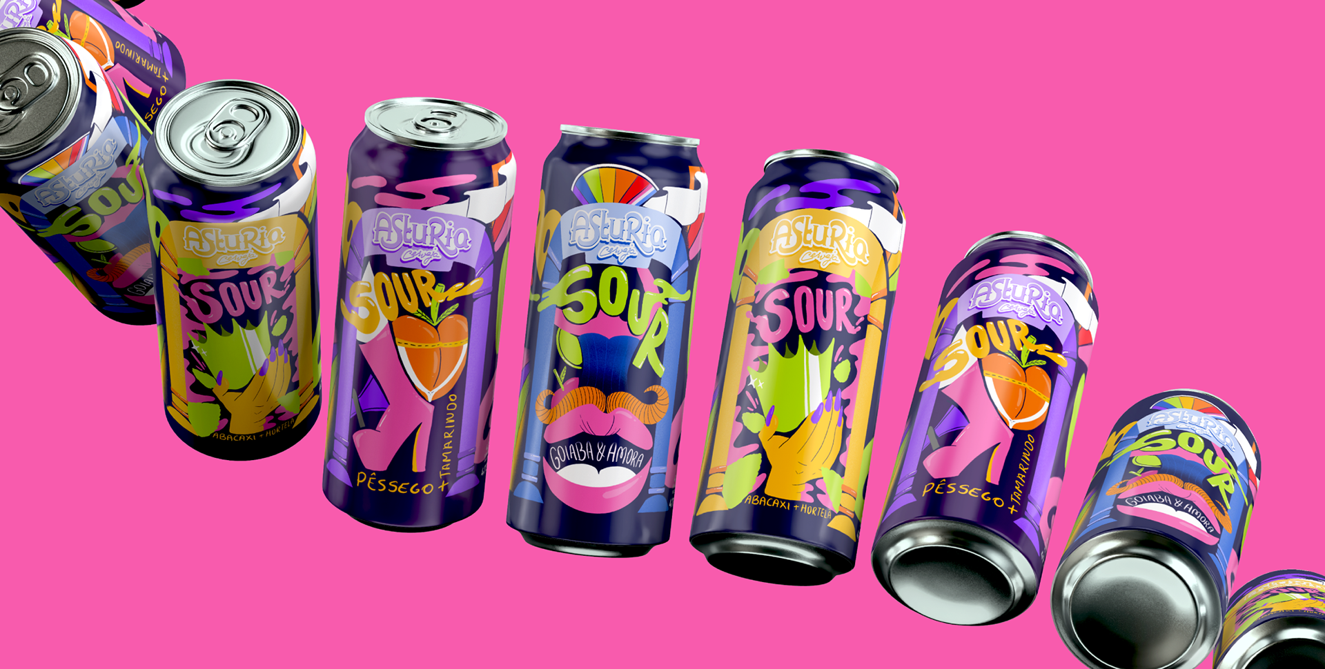
Sour Asturia Pride
EN
The final set of four packages is connected through a consistent chromatic palette, striking illustrations, and a unified layout that allows variation without losing identity. The Sour Asturia Pride project stands as a design proposal that breaks away from the logic of seasonal and commercial actions, offering packaging as a medium for representation, pride, and cultural resistance. More than just a product, the collection positions itself as a visual narrative that values the diversity and authenticity of the LGBTQIAP+ community.
PT
O conjunto final das quatro embalagens conecta-se por meio de uma paleta cromática consistente, pelo uso de ilustrações marcantes e por um layout unificado que permite variação sem perder identidade. O projeto Sour Asturia Pride se apresenta como uma proposta de design que foge da lógica das ações sazonais e comerciais, propondo embalagens que funcionam como suportes de representatividade, orgulho e resistência cultural. Mais do que um produto, a coleção se posiciona como uma narrativa visual que valoriza a diversidade e a autenticidade da comunidade LGBTQIAP+.


The project was presented to the Asturia brand as a proposal for implementation, reinforcing the possibility of applying the developed design to the actual Sour beer packaging line.
-
-
O projeto foi apresentado à marca Asturia como proposta de implementação, reforçando a possibilidade de aplicar o design desenvolvido às embalagens reais da linha Sour.
Thanks for watching
Thanks for watching
